

Blink 2024 // And Beyond
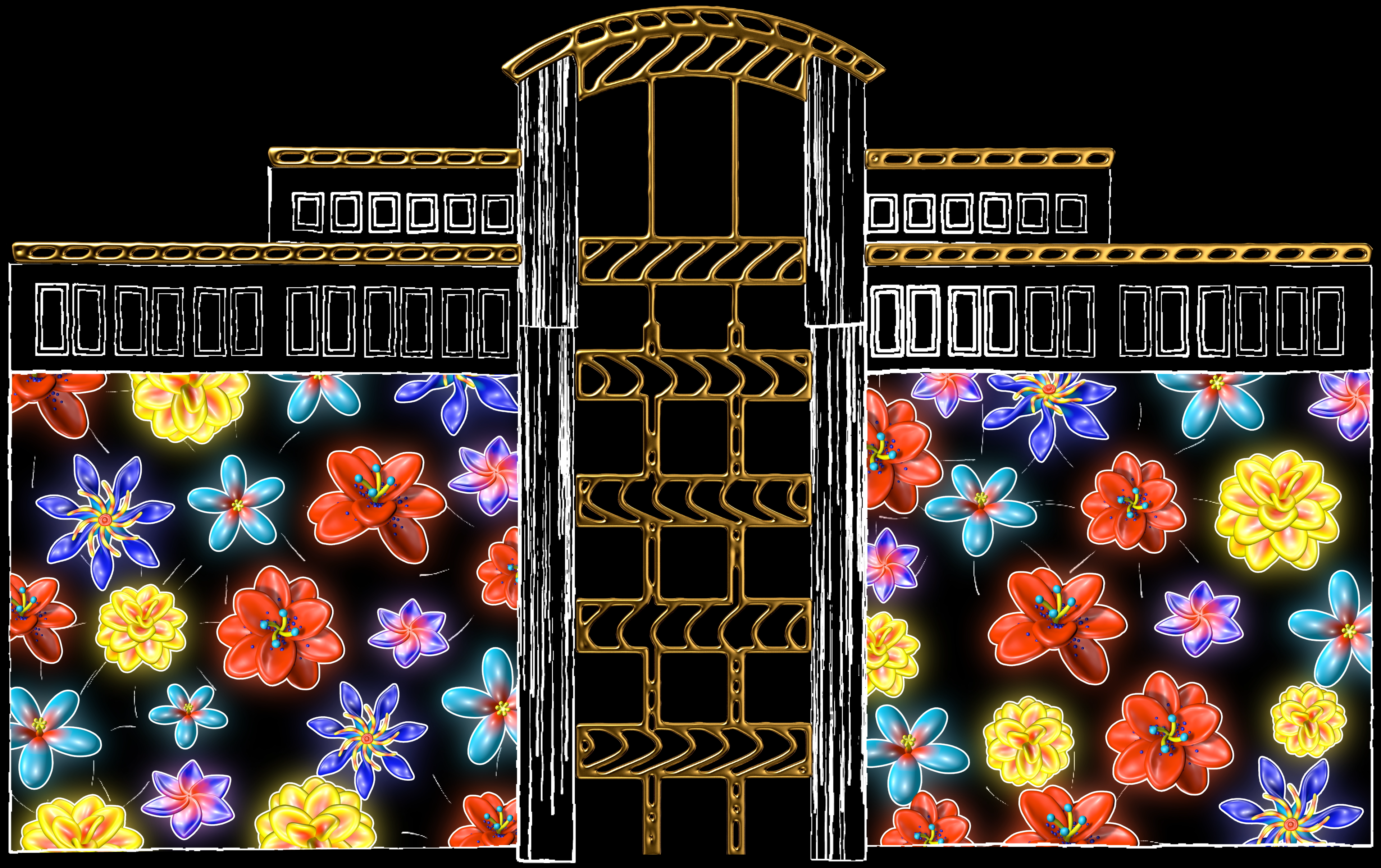
I was commissioned to create this projection mapping piece for Blink 2024 in Cincinnati, continuing the absurd, weird energy of my previous piece, To The Moon. The whole thing was built from scratch for the building, with a loose, experimental approach that let the architecture dictate what stayed, what changed, and what got weird.
The Concept
For this piece, I kept the process loose. I start with a pile of ideas and let the building decide which ones live. Out of every ten, maybe one or two survive the architecture. For this reason, and my own artistic preference for what I enjoy making, I tend to intentionally avoid locking into a specific theme or a story.
The style tends to follow this same throughline, creating a cohesively incohesive, fresh, digital mixed-media approach. It's a lot of experimenting, seeing what works, and more often than not, what doesn't. Then figuring out how to mash it all together.



The Environment
The Blink environment can be a bit crazy. There's a lot going on and a lot of people. There are street lights, car lights, giant projectors on giant scaffolding, and storefronts glowing everywhere, with people constantly moving, drinking, and chatting. The piece plays on a loop, so there's no official start. Some people walk up a minute in, some three minutes in, and a few lucky ones catch it right at the beginning. And with 90+ installations across the festival, there's a lot competing for their time.
I tried to keep it high-energy and fast-paced, no matter when someone walks up, something exciting is happening. Short and sweet.

The Building
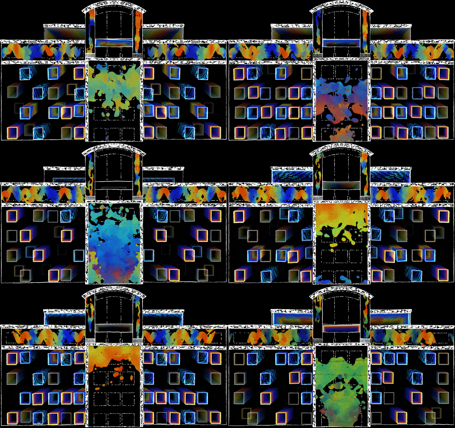
I try to avoid simply cropping graphics into certain portions of the building. Whenever possible, I want the actual animation to move and bend with the architecture of the building. Things break and hit windows as they fall. Objects and graphics are dynamically boxed into sections of the building and bounce off walls.
Windows are the trickiest part of a building like this. Some have lights on, some have curtains, some show nothing, so I assume little will show up on them. As a general rule of thumb, I've found three things hold up consistently well:
• Large scale graphics that cover huge sections of the building
• Graphics designed specifically for the space between the windows
• Abstract designs, particles, or patterns where we don't need to see all of it
What tends to fail are medium sized graphics. Half of one can disappear behind a window and you can't tell what you're looking at.
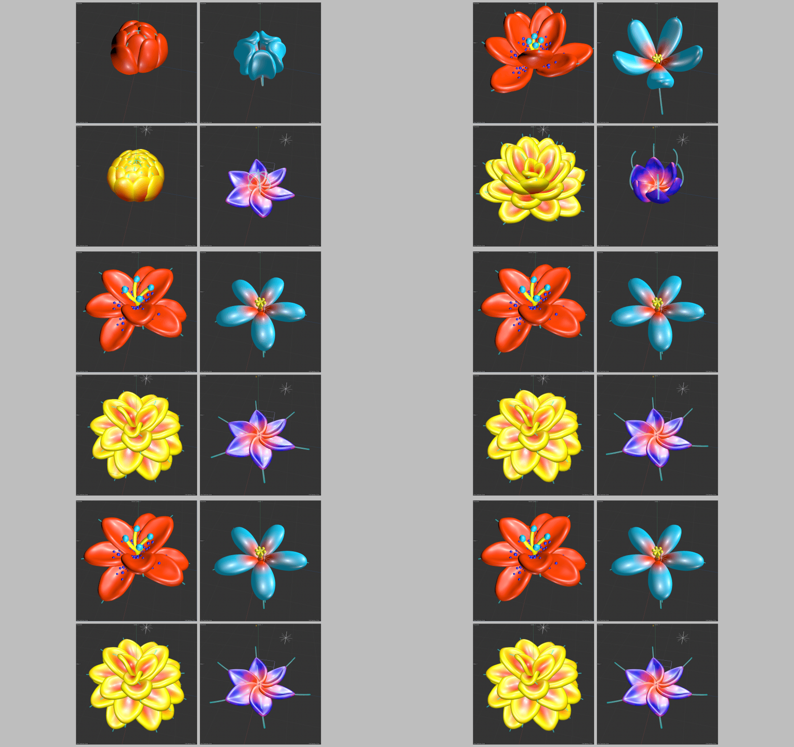
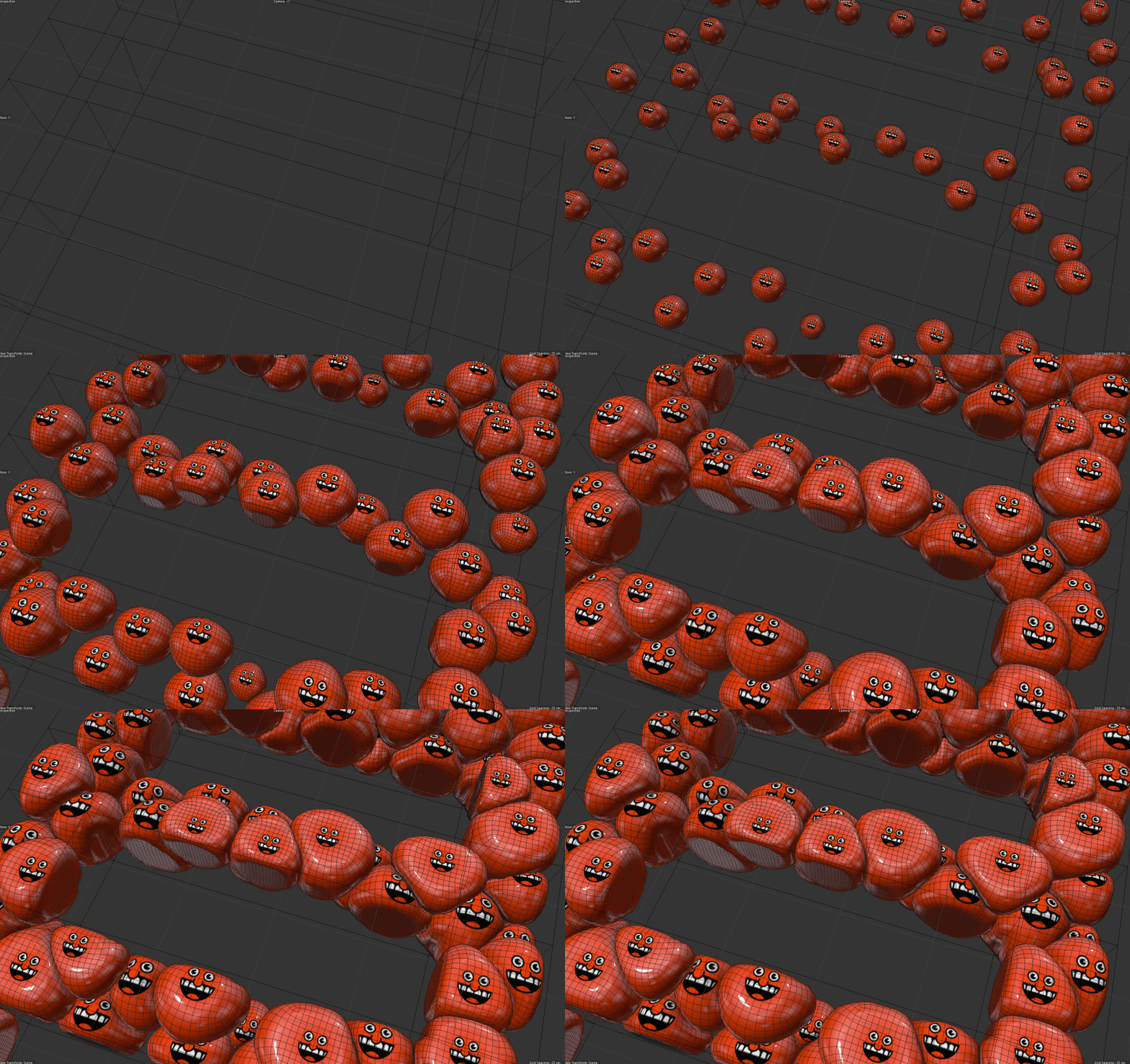
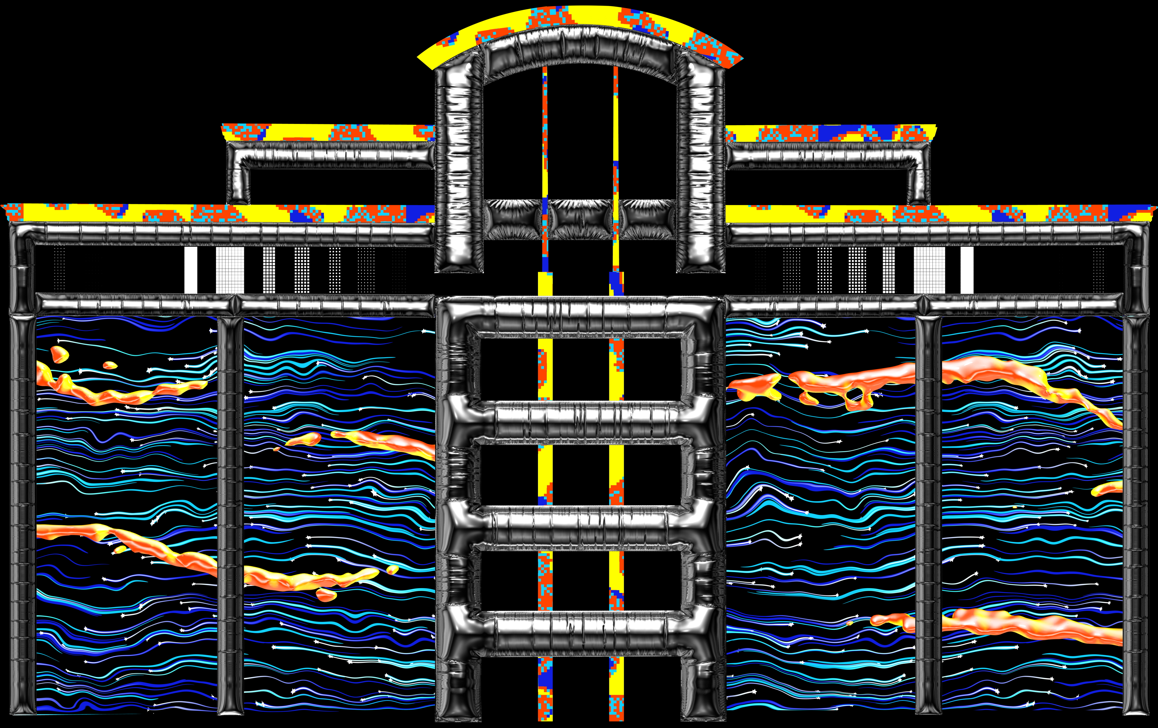
Every element was built from scratch for this building.



The Frames




Creative Direction, Design, Illustration, Animation, Sound Design, Everything
Sean Van Praag
Main Sequence Music
Klayton